I established the visual styles for Spellbreak, as well as a large portion of the navigation architecture and interaction. These are some examples of specific features that I designed (all text, buttons, containers, UI colors, layouts, most icons, and the underlying UX is my work).
Slow motion video of the trailer loops behind this overlay upon opening the game
Interaction is concentrated on the left to easily moved through your party list and game mode selection, quests on the right are static and could easily become scrollable in this layout, should the need ever arise. Previously characters we interactable but this solution made party management easier to find.
I designed all UI for Dominion mode, including HUD elements and this screen to upgrade items.
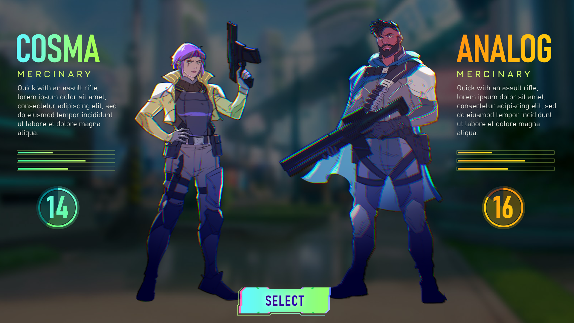
Note: The character is not my art
I designed the shop layout and styles
In the Mastery screen, rewards and stats are highlighted with the particular color palette assigned to each class.
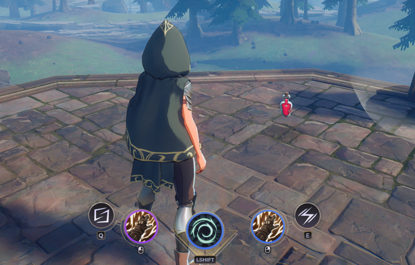
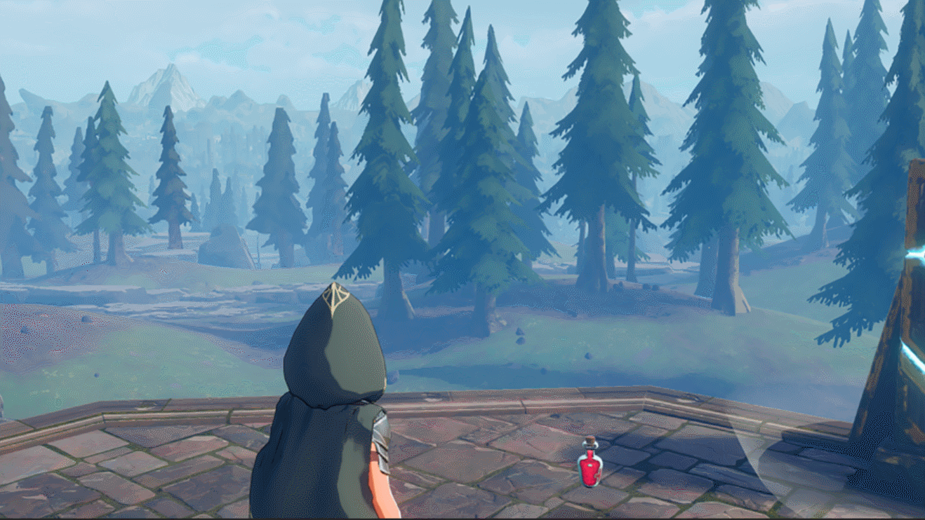
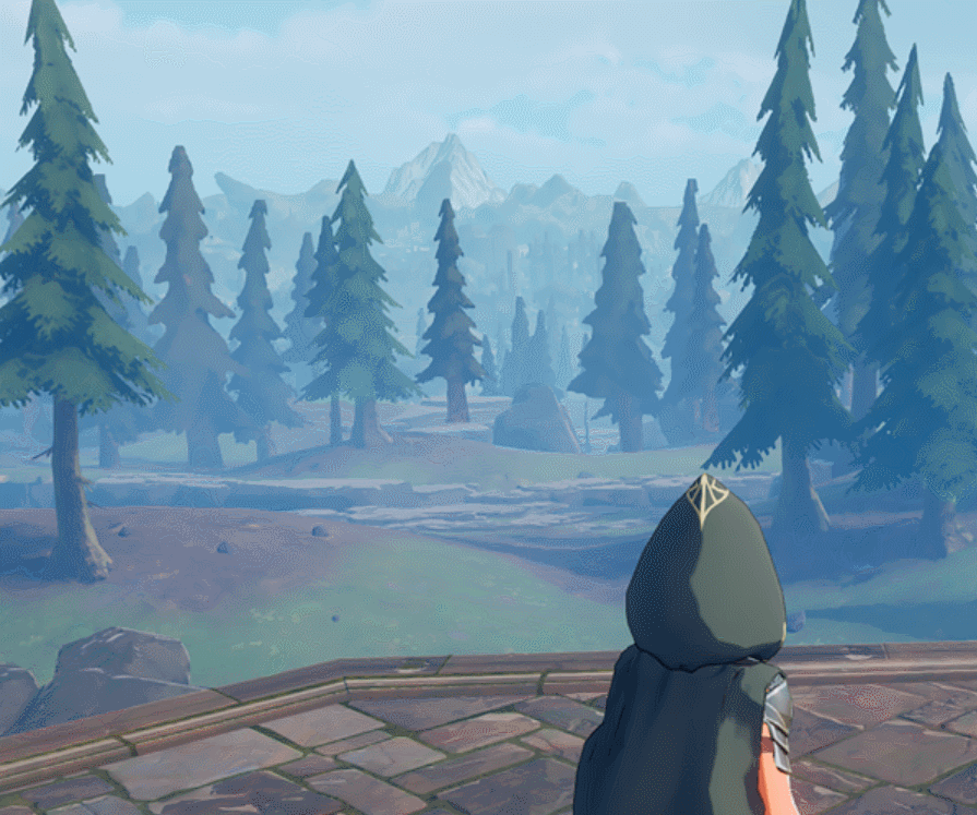
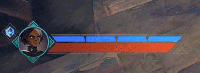
I designed the HUD for Spellbreak, a magic battle royale. This included working closely with Gameplay Design to make sure every animation communicates the right information. I also worked very closely with Gameplay Engineering, often designing on the fly, to make sure everything feels just right.
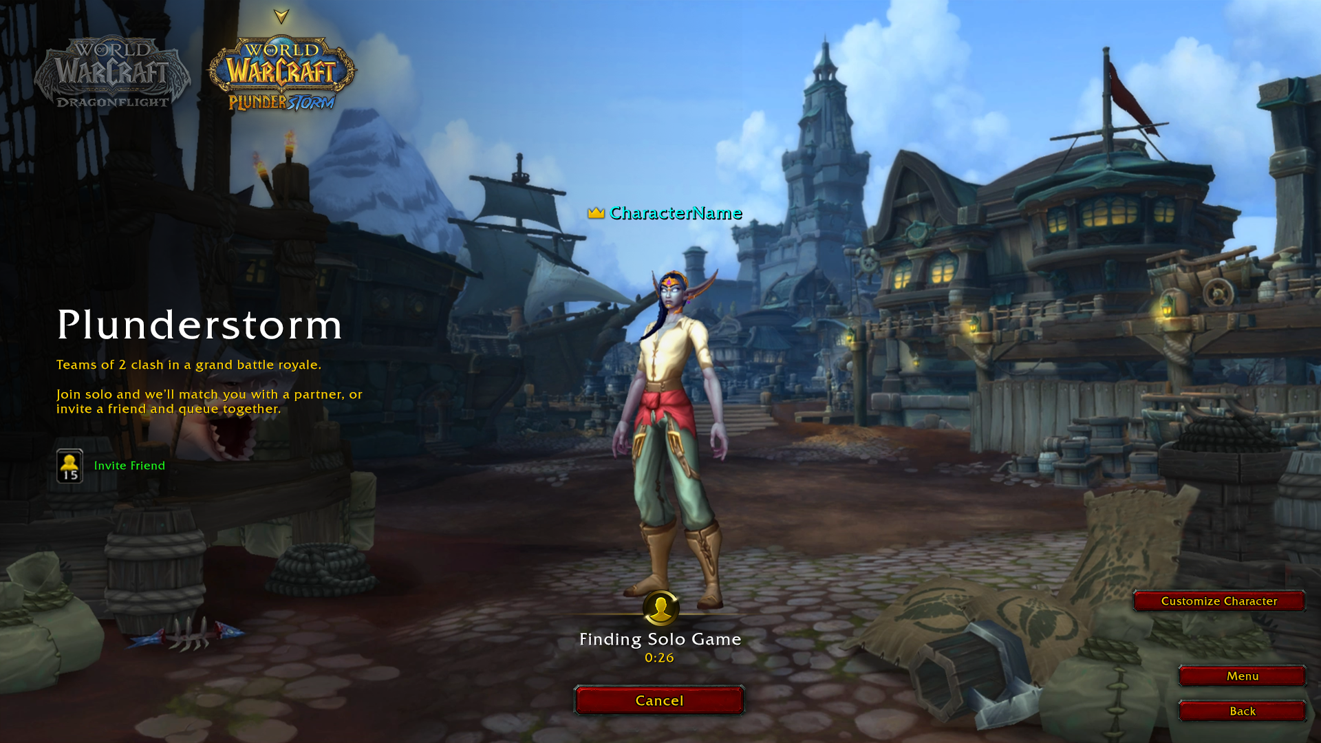
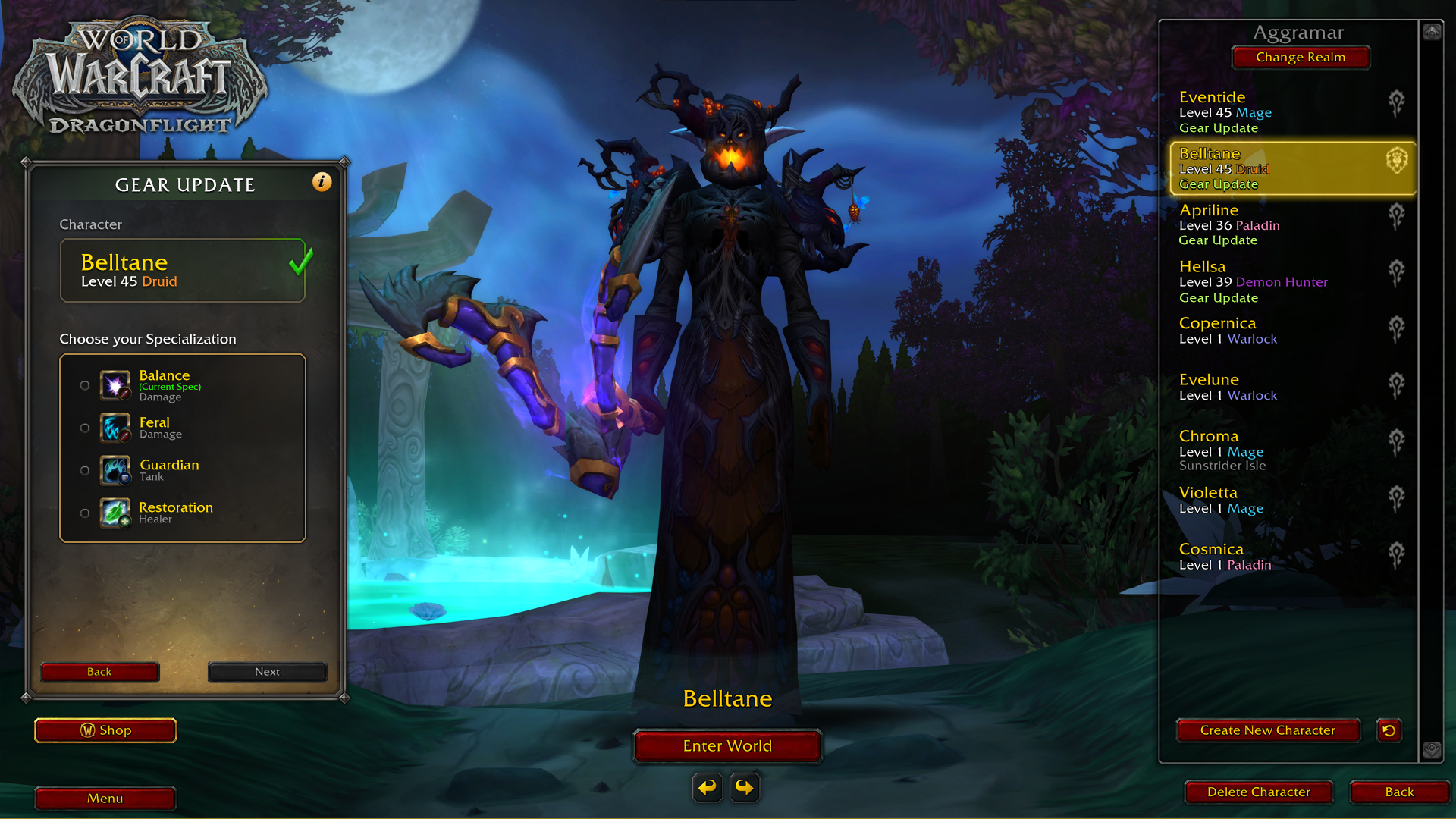
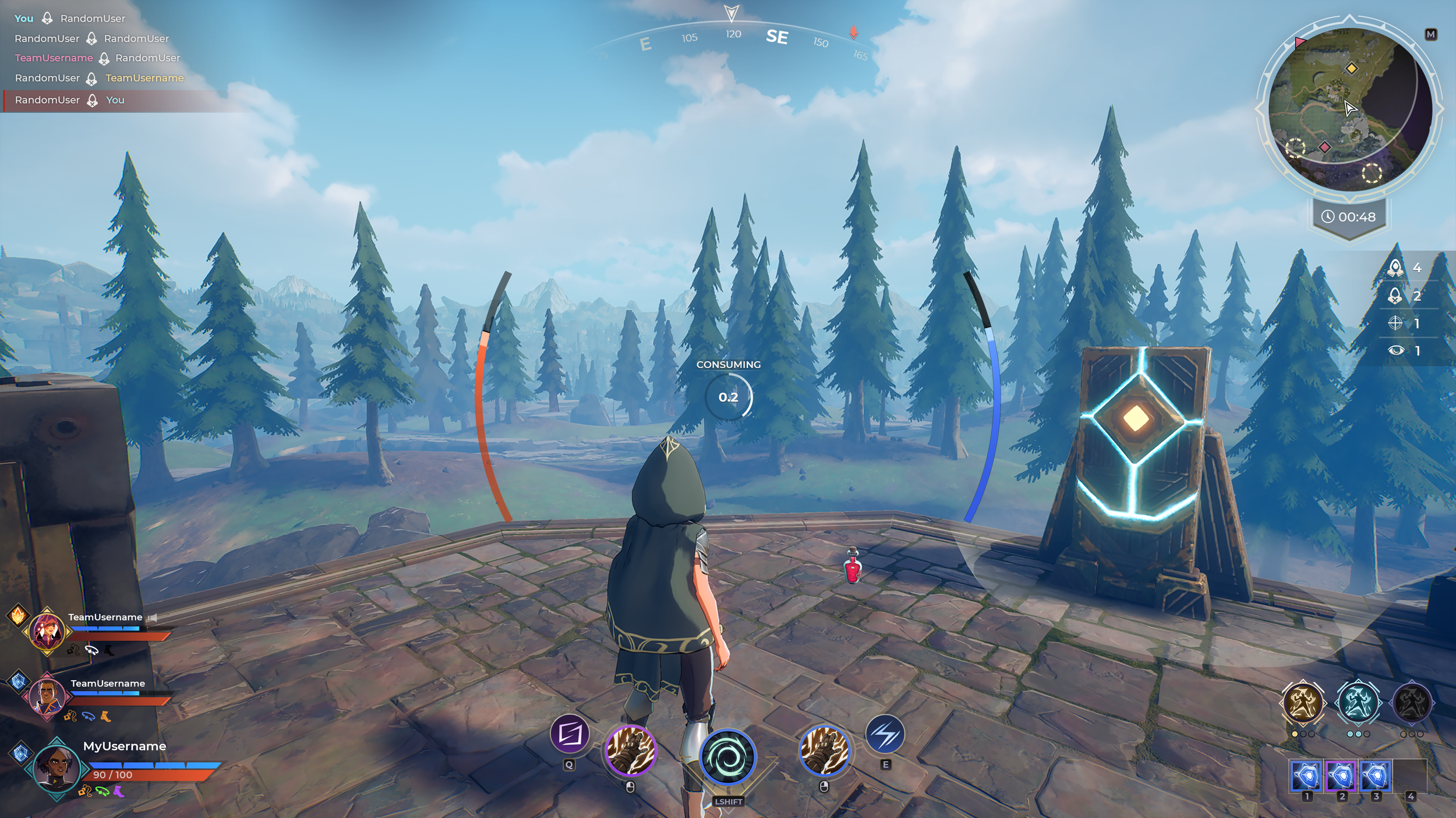
Plunderstorm was an experimental game mode within World of Warcraft. The aim was to use the existing platform that WoW is built on to create a Battle Royale. I owned the UI Art for this, and worked on many of the UX challenges that came with movement and interaction that deviated from the way WoW typically works (e.g. interacting with in-world items, slotting new abilities in the heat of battle etc.)
The UI Art needed to match the larger WoW style, but there was a bit more wiggle room to simplify and modernize than there is in the main game.
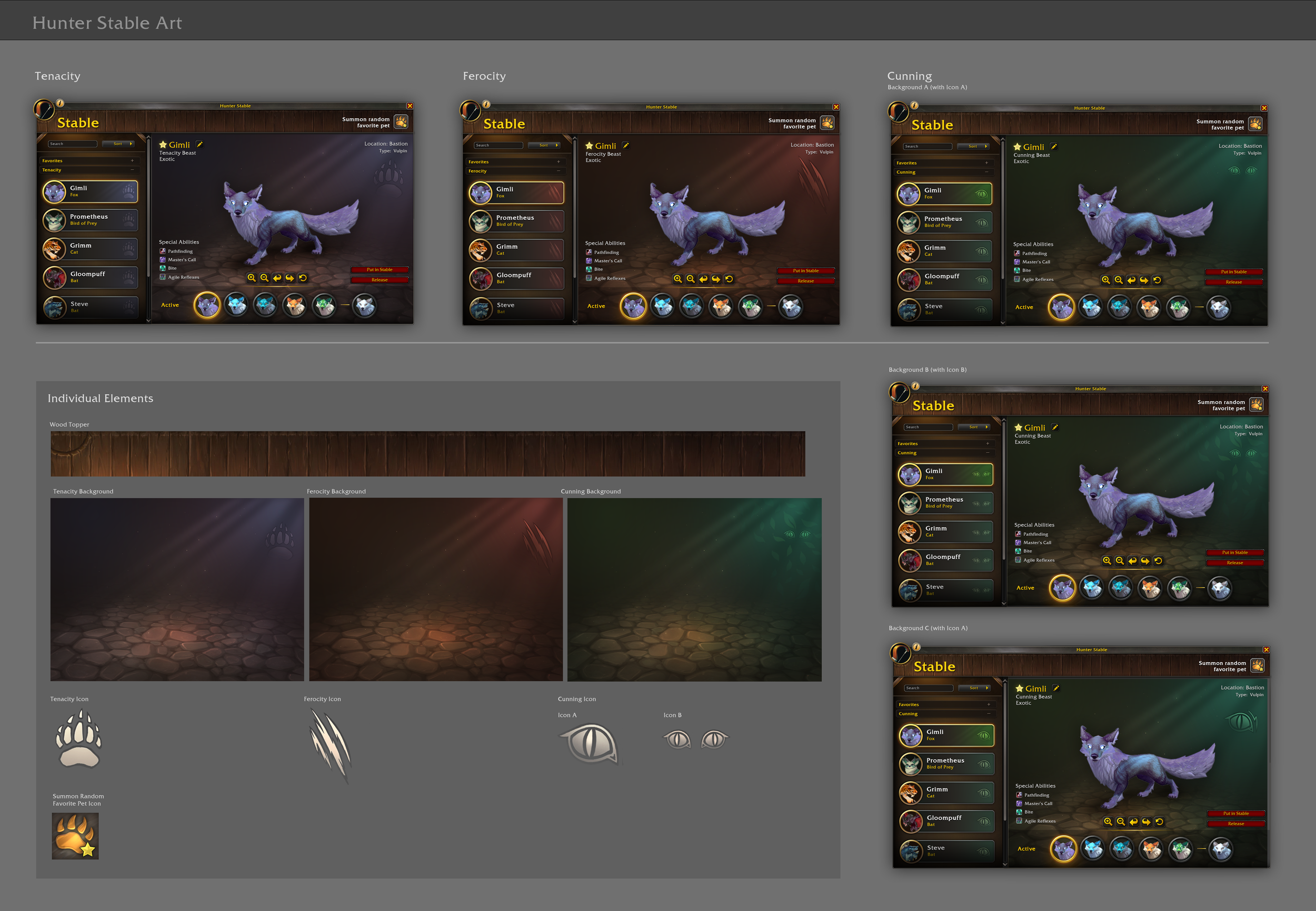
Hunter Stable Redesign:
I created the art for the Stable UI in which the Hunter class keeps their pets. This UI allows them to see all of their pets in a list, the specialization of that pet, and their upgrade progress.
Icons:
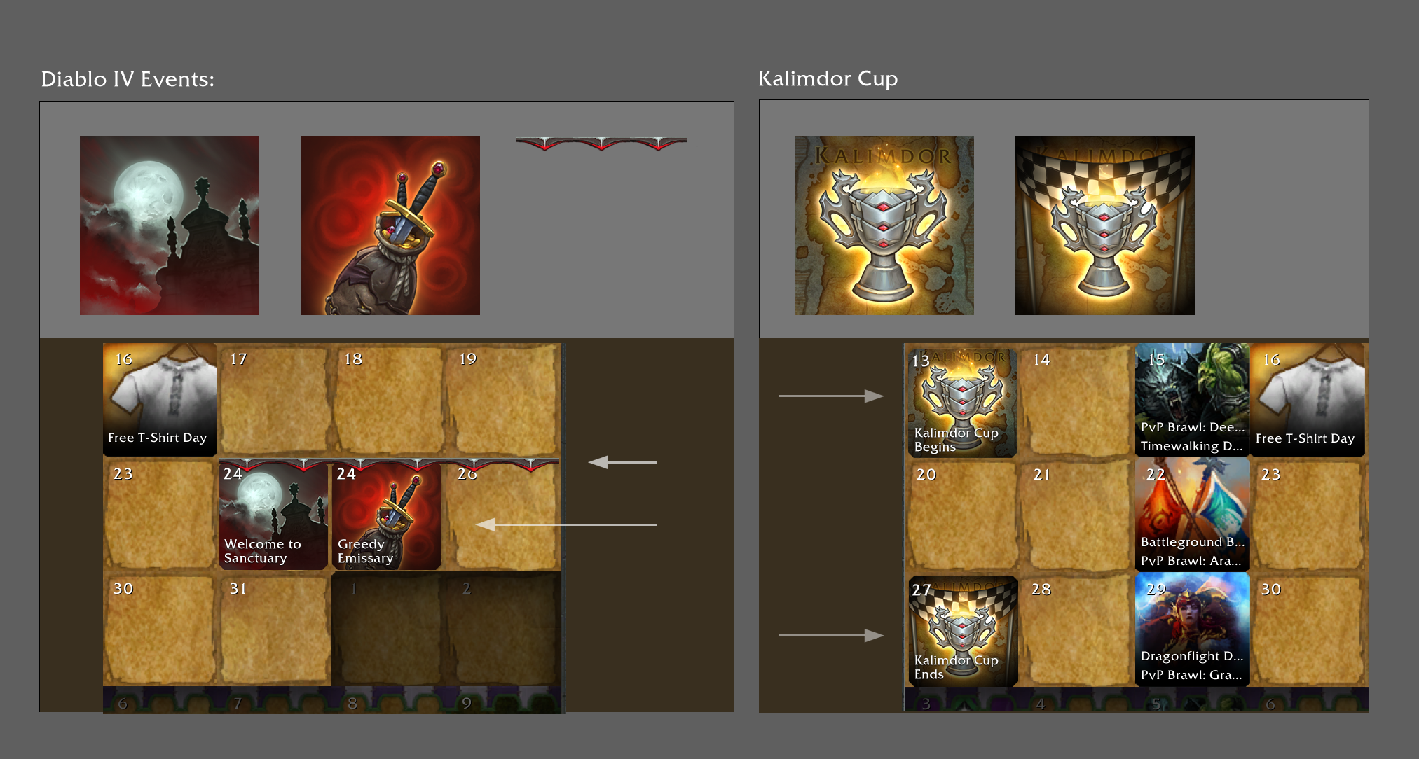
These are two of the icons I've made for WoW. These two are from a Dreamsurge event during the spring.
Major Factions:
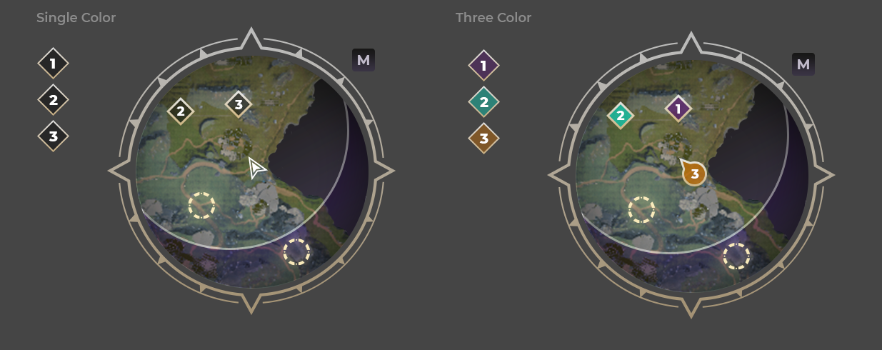
Hand painted assets for all Major Factions UI, including panels, frame art, and minimap icon for the Dragonflight expansion of World of Warcraft. This was my first project on WoW and served as a valuable exercise in sticking to established styles while working to move the design forward.
My layout below with a radial progress bar breaking the frame as well as the flatter, color gradient list items have been adopted into WoW's style for future features.
Designed the visual style of this mobile idle game. Created all UI art, icons, and style guides. I was also responsible for UX, laying out screens and user testing them, as well as implementing the layouts in Unity.
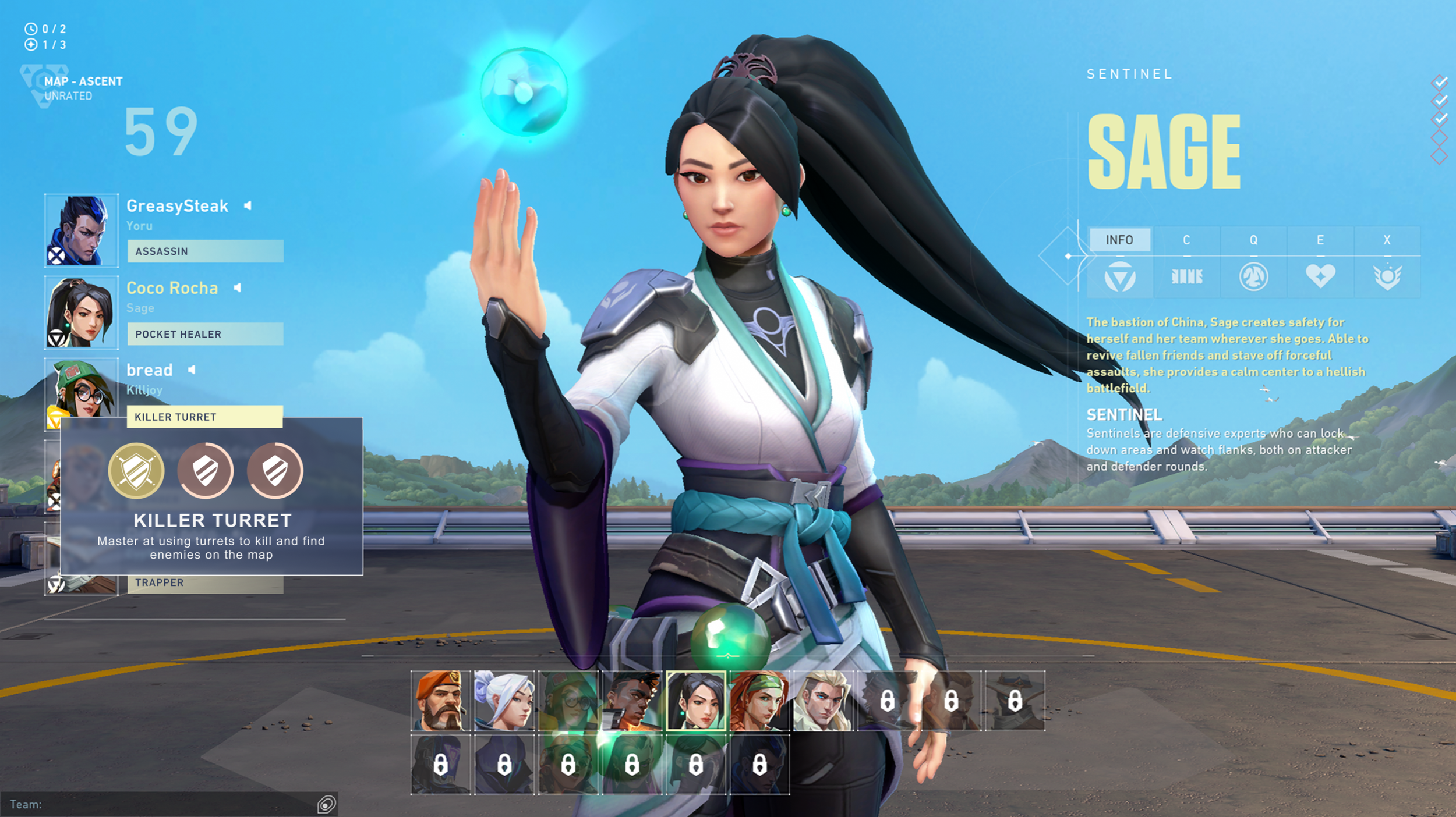
I did contract work for Valorant, working on the UX layout for Agent Mastery, and adhering to their UI Art style (characters and icons are not my art, just layout, gradients, and interactive elements)
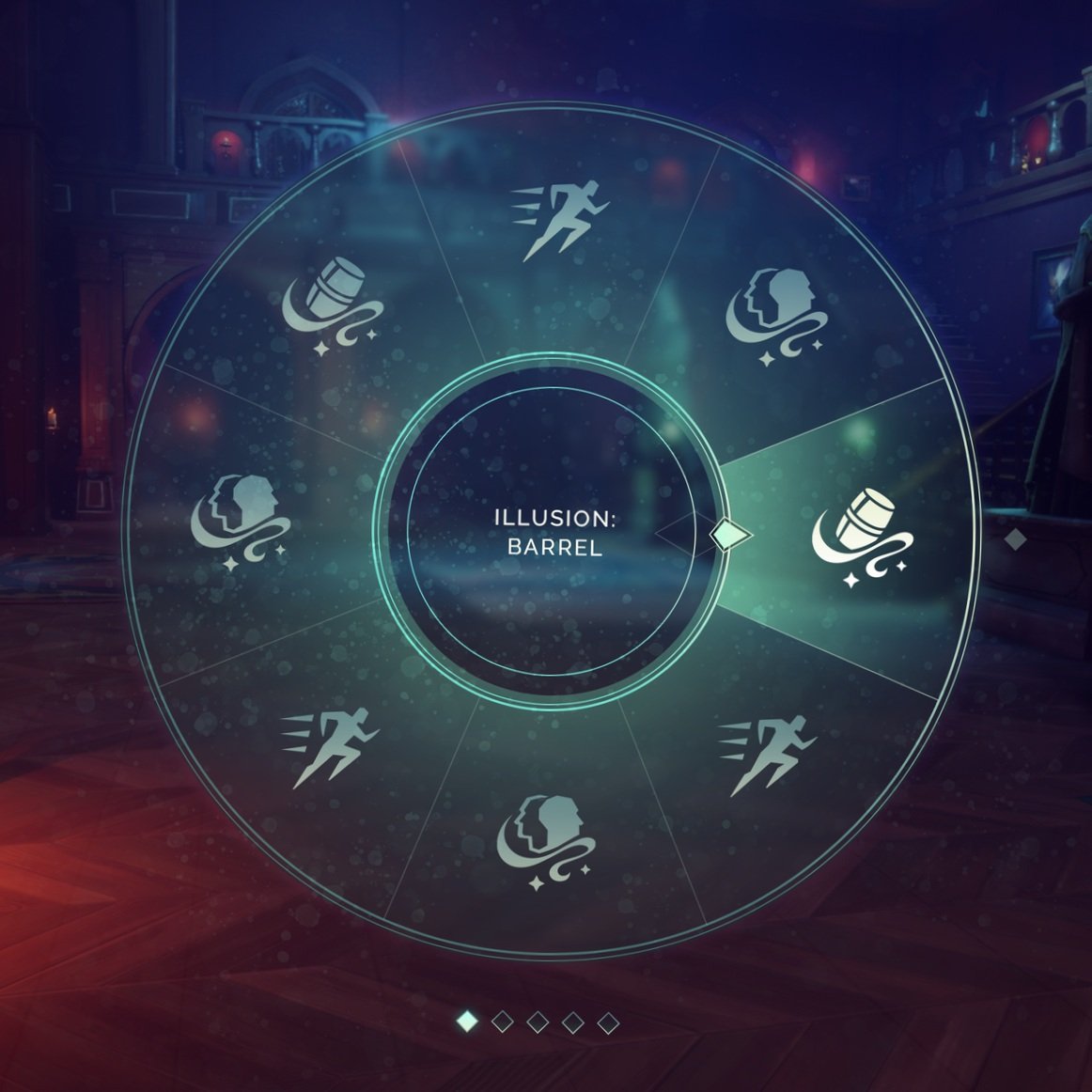
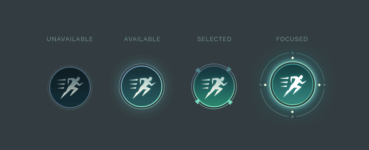
This game was an unannounced project that we shelved at Proletariat. It was a Solar Punk rogue-lite shooter taking place in a virtual, green city that was mysteriously abandoned.
To evoke the feeling of this world, I developed a visual UI style that utilizes glassmorphism to give it a modern look, vibrant colors for optimism and fun, but with glitchy animations and chromatic aberration to gently communicate that the positivity is a projected facade.
All UI elements, icons, and visual styles are my work. The aesthetic goal was industrial punk and art-deco with some higher technology.
Here are a few recent freelance projects:
Panopticon: A logo for an indie game studio
Brato: Logo and branding for a local brewery and kitchen
Sandy Ewing for City Council: Campaign signage, website, and branding for a Tennessee Councilwoman (she won the election)